Introduction
When working with data in Python it is often required to visualize the information. It simply makes it easier to understand and also might reveal hidden parts of the data set that is not obvious when looking at the raw numbers.
This post is a crash course on the matplotlib plotting library. We'll see how to plot basic diagrams such as bar chart, pie chart, line chart and scatter plot.
Matplotlib is not limited to use these basic diagrams though -- it does provide a comprehensive set of plotting functions., it's an excellent library. Matplotlib is also commonly used in the data science world of Python.
How to Install matplotlib
Like almost any other Python module, matplotlib can be installed using pip:
~ $ pip install matplotlib
Bar Chart
One of the most popular diagrams is the bar chart.
In order to demonstrate the charts with some meaningful examples going forward, we'll use soccer related sample data.
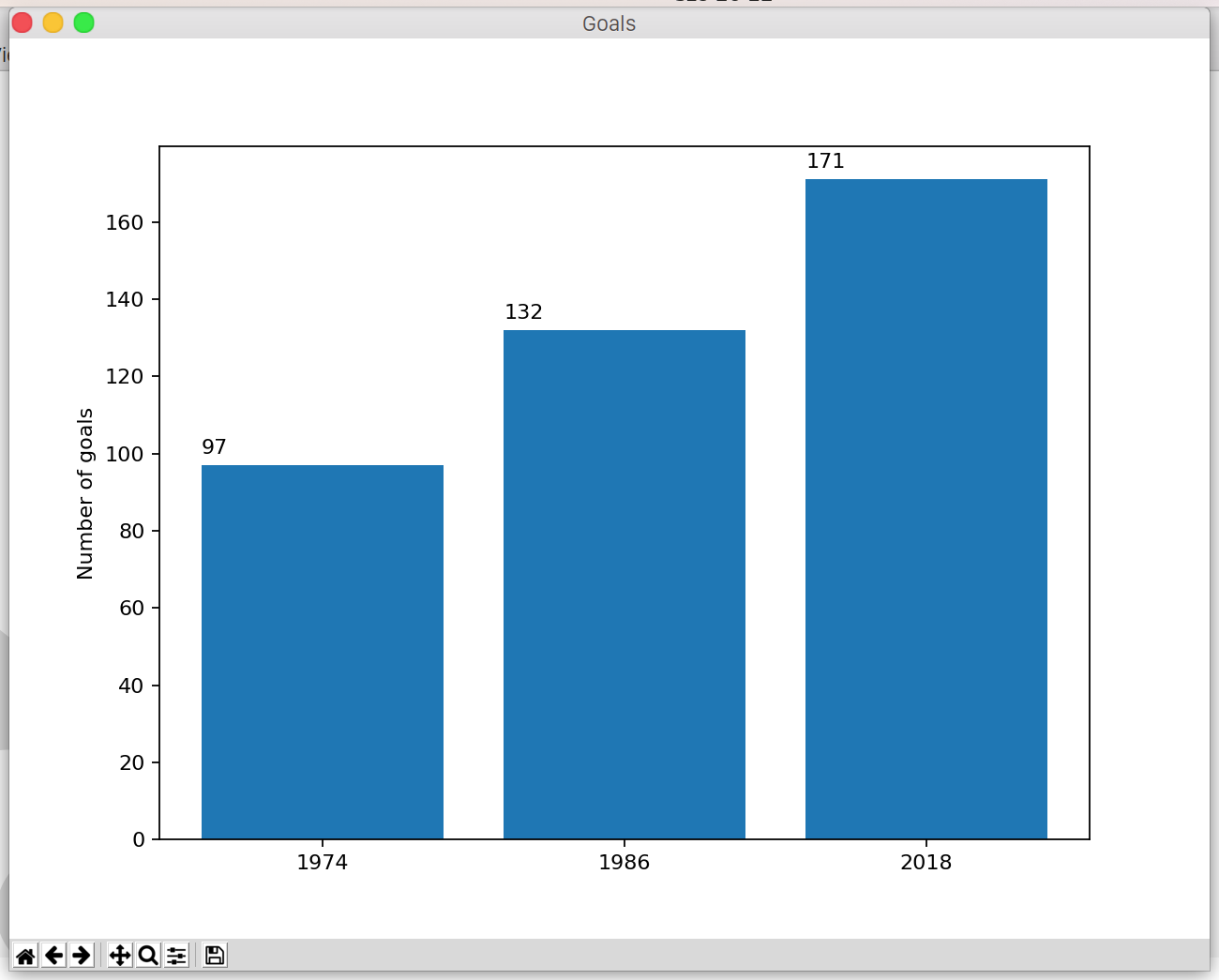
The code below creates a chart showing how many goals were scored in the world cups in the specified years.
import matplotlib.pyplot as plt

years = ["1974", "1986", "2018"]
goals = [97, 132, 171]

bars = plt.bar(years, goals)
for i, bar in enumerate(bars):
    plt.text(bar.get_x(), bar.get_height() + 3, str(goals[i]))

plt.ylabel('Number of goals')
plt.show()
First, the module has to be imported and we'll refer to it as plt.
The years variable is an array and contains the x coordinates. Similarly, goals holds the y values. We can also use tuples instead of arrays to store the values.
What's also interesting to mention here is the plt.txt method. This allows you to put the y values on the chart.
The result will look lke as follows:
Bar Chart With Multiple Values
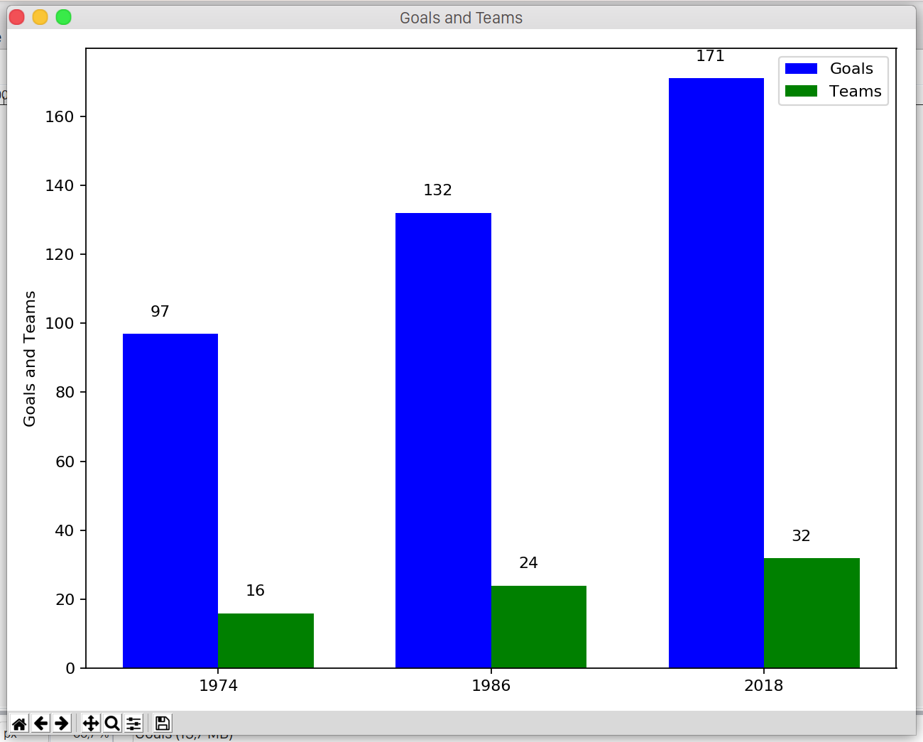
It's not uncommon that we want to represent data in a bar chart where we have multiple values to the same x coordinate.
For example, on the previous figure we can see that there were way more goals scored in 2018 compared to the previous years. But that plot didn't show that there were only 16 teams participating in 1974 and 24 in 1986. On the other hand, there were 32 teams attending in 2018.
The following code snippet takes the team information into account and adds it to the chart:
import matplotlib.pyplot as plt

year = ["1974", "1986", "2018"]
goals_and_teams = [ [97,16], [132,24], [171,32] ]

w = 0.35
index = range(1, len(year) + 1)
second_index = [x + w for x in index]
third_index = [x + w/2 for x in index]

goals = [x[0] for x in goals_and_teams]
teams = [x[1] for x in goals_and_teams]

goal_bar = plt.bar(index, goals, w, color='b', label='Goals')
team_bar = plt.bar(second_index, teams, w, color='g', label='Teams')

for i, bar in enumerate(goal_bar):
    plt.text(bar.get_x() + 0.1, bar.get_height() + 5, goals[i])

for i, bar in enumerate(team_bar):
    plt.text(bar.get_x() + 0.1, bar.get_height() + 5, teams[i])

plt.ylabel('Goals and Teams')
plt.xticks(third_index, year)
plt.legend()
plt.tight_layout()
plt.show()
The result is:
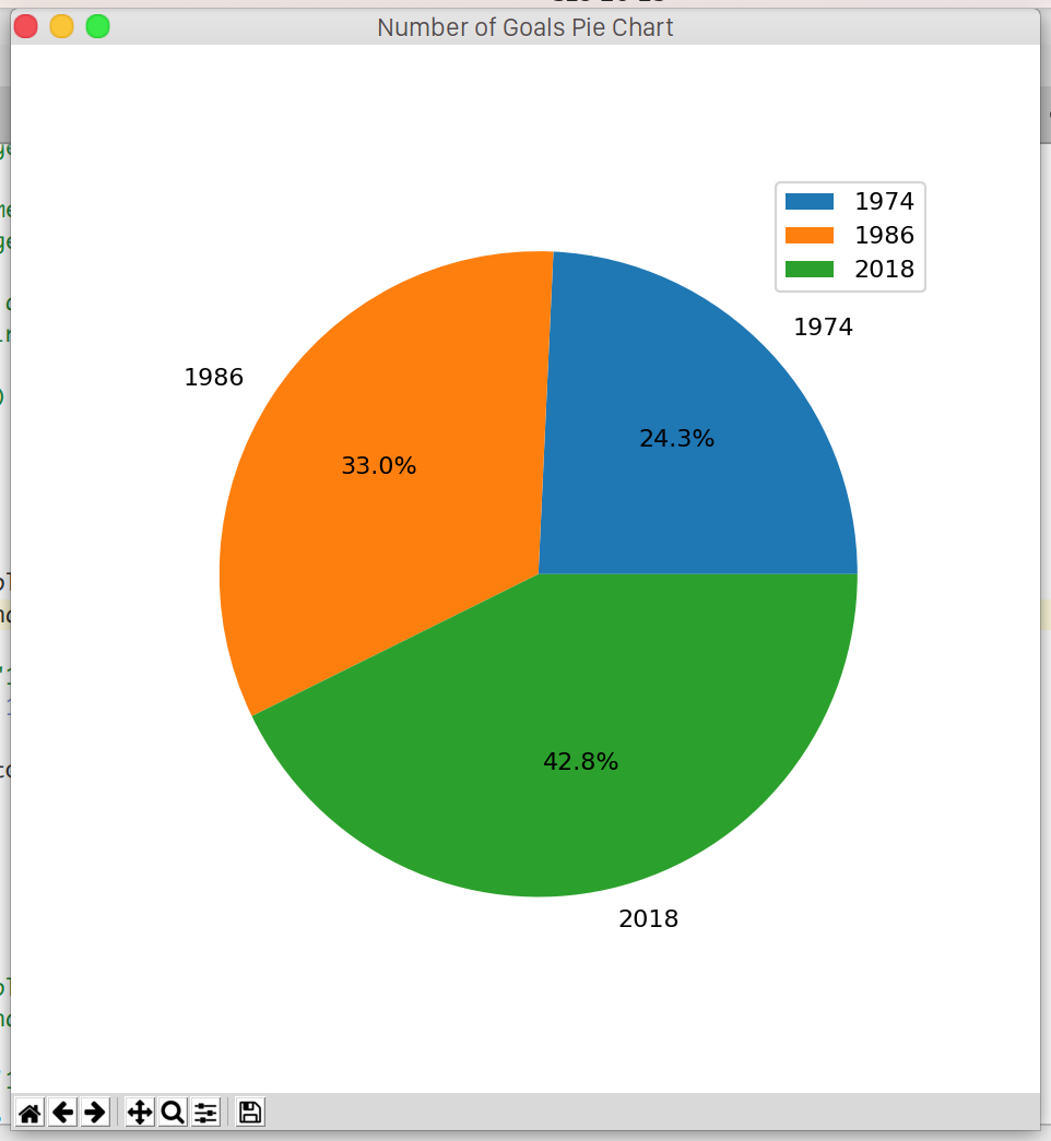
Pie Chart
The matplotlib library provides a method to draw pie chart as well:
import matplotlib.pyplot as plt

years = ["1974", "1986", "2018"]
goals = [97, 132, 171]

plt.pie(goals, autopct='%1.1f%%', labels=years)
plt.legend()
plt.show()
Line Chart
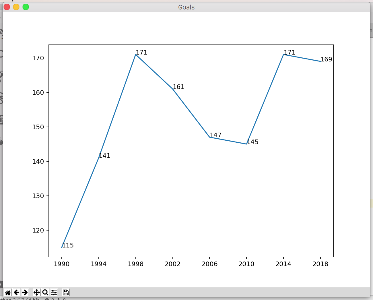
The next one is the line chart. The following figure shows the goals scored from 1990 until 2018.
import matplotlib.pyplot as plt

years = ['1990', '1994', '1998', '2002', '2006', '2010', '2014', '2018']
goals = [115, 141, 171, 161, 147, 145, 171, 169]

plt.plot(years, goals)
for i in range(0, len(years)):
    ax.annotate(str(goals[i]), xy=(years[i], goals[i]))

plt.show()
The annotate function adds the values to the figure.
Scatter Chart
The scatter chart is usually used when we want to visualize the relationship between two variables.
import matplotlib.pyplot as plt

years = ['1930', '1934', '1938', '1950', '1954', '1958', '1962', '1966', '1970', '1974', '1978', '1982', '1986', '1990', '1994', '1998', '2002', '2006', '2010', '2014', '2018']
goals = [70, 70, 84, 88, 140, 126, 89, 89, 95, 97, 102, 146, 132, 115, 141, 171, 161, 147, 145, 171, 169]

plt.scatter(years, goals, 35,  alpha=1.0)
plt.show()
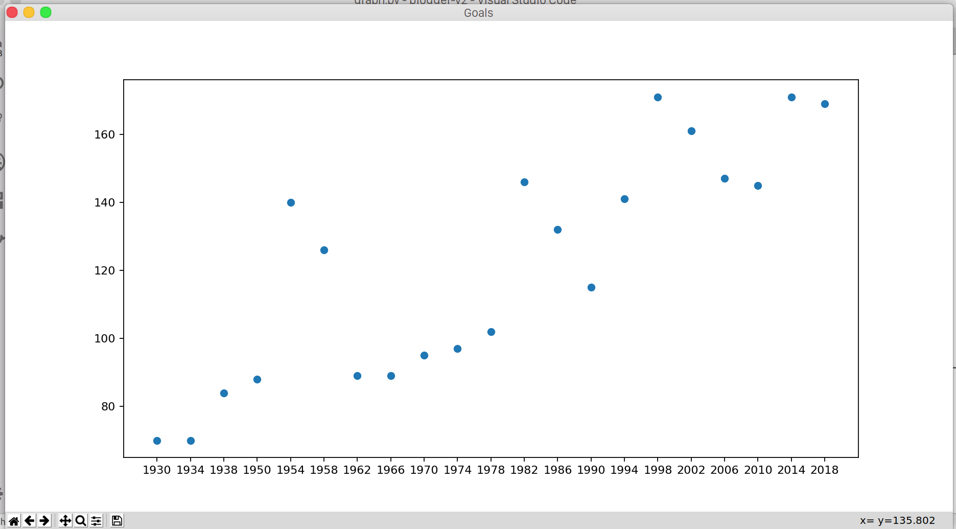
In our example we examine if there's a connection between the year of the world cup and the goals. As mentioned above, the number of attending teams increased over the time. The current, 32 teams format was introduced in 1998.
The scatter plot reveals an interesting pattern. Since 1998 there were two subsequent years with high amount of goals, then it dropped for the next two world cups. However, in 2014 and 2018 the teams scored more than 160 goals again. What will happen in 2022?
How to Export Figure to Image File
You can use the savefig method to easily export your diagrams to PNG file:
plt.savefig('foo.png')
Wrapping Up
We've seen that only we can visualize the data only using a few lines. However, we only scratched the surface of matplotlib. In case you're looking for a different plot, you'll most likely find in matplotlib -- it's basically the de facto of data visualization in Python.